From the PARcore Data Visualization Studio Landing Page, navigate to this report by selecting the Comparison Plots report icon. This report is only applicable for requests that include the Analysis Type of Item Response Theory and include the option to Produce TBLT.
The bento box menu icon at the top left of the report can be used to navigate back to the Landing Page.

Information about the request that is being viewed are displayed at the top, including the request number, admin, test, form ID or package ID, user form code, and system form code.
When first launching the report it will be empty. Make initial filter selections in order to visualize the report. Any filter with a red asterisk indicates it is required to have a selection made before the report can be displayed.
Choose Filters

Refer to Visualize Results for general information about filter navigation for any report. The filter for this report is:
- Upon first initializing this dashboard, the filter will display as (Choose your analysis) and a selection must be made.
- Select the search icon (magnifying glass) and enter search text to see Analysis filter options for the request you are viewing.
- Using an asterisk in the search text box will display all possible analyses to choose from.
- Once the current analysis results have been reviewed, continue to use the search feature or utilize the slider arrows (< and >) to view each analysis one at a time. If there is only one analysis for this report the navigation buttons will be disabled.
- The analysis template name used for this request analysis will also be included in the filter description.
To the left of the graphs are two additional filtering options:
Axis Range Options - this is a radio button filter with two options

- Restrict Range - selected by default.
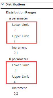
- This option will set the range for the four parameter-specific graphs based on the user selections made in the "Distributions" section of the Request Details. If this analysis has polytomous items, the (b-d)-parameter range is the same as the selected b-parameter limits. This filter option has no impact to the Test Characteristic Curve graph.

- All Observed Values
- This filter option will change the Y-axis and X-axis ranges on the parameter graphs based on the observed data range. This option will allow the user to see outliers that may fall outside of the "restrict range" graph. Additionally, if the observed values fall within a narrow range, this option may enhance your view to provide a more narrow range of focus. This filter option has no impact to the Test Characteristic Curves graph.
Highlight Accession Number - this filter allows the user to find and highlight a specific accession number in the plot(s).
- Accession numbers are listed alphabetically but users can enter into the search text box (with the gray font text "Highlight Accession Number) to narrow the selection as needed to find the accession number they want to view.
- When selecting an accession number, it will automatically highlight that item in the parameter plot(s).
- All common items are displayed in this list. If viewing the "Restrict Range" plots, an item that is an outlier will still appear on this list, but when selecting it for highlight there will be no data points highlighted. To see outliers highlighted, change the axis filter option to "All Observed Values".
- For the b-d parameter plots, some accession numbers may be missing reference statistics and therefore are not included in this plot. Refer to the Parameter Comparison tab of the "Parameter and Statistics" report to identify which items, if any, have missing reference statistics. If the reference statistics are coming from a legacy request (either from the database or from a previous request directly) some item types, such as Speech items, did not have (b-d) statistics stored and therefore those fields cannot be plotted.
- To close out of a selected accession number, select the "X" icon in the filter.

Plot Details
There are four potential parameter scatterplots that are generated for TBLT, depending upon your analysis. Each plots the New and Reference values for the parameter statistic for all of the common items in the analysis.
- Untransformed b-parameter plot
- Transformed b-parameter plot
- Transformed a-parameter plot
- Transformed (b-d) parameter plot
- The (b-d)-parameter plots are only available for analyses with polytomous items and only polytomous items are included in that plot.
- Only items that have both new and reference statistics present are included in this plot. Refer to the information above in the "Highlight Accession Number" section for more information.
Dichotomous items are represented by circles, and polytomous items (if present) are represented by "X" markers within the same plot. The axis ranges can be adjusted by using the "Axis Range Options" radio button filter.
If the "Produce Test Characteristic Curve" option is selected as "Yes" in your request details there will be an additional TCC plot included. This graph represents the common items only.
- In PARcore, the Y-axis for this plot is the "True Score", which is a change from the previous report produced by GENASYS, which had a Y-axis of "Proportional True Score".
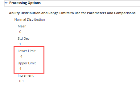
- The axis range for this plot is set based on the ability distribution options set in the "Processing Options" section of the Request Details. The "Axis Range Options" filter has no impact on this plot.
Example of Ability Distribution Ranges selected for an analysis in the Analysis Template and Request Details

For each plot, a tooltip is available when hovering over a data point to identify the statistic values for that data point.
If desired, utilize the zoom feature to expand any of the plots to get a closer view of a set of data points. Refer to Visualize Results for general information about zoom functionality.
Additional statistics are produced and available to users beyond what is presented in the Data Visualization Studio. Refer to the RTSSTAT API and Download Statistics help documentation for more information regarding accessing all of the available statistics produced.
