From the PARcore Data Visualization Studio Landing Page, navigate to this report by selecting the Item Scatterplots report icon. This report is only applicable for requests that include the Analysis Type of Item Analysis - Classical.
The bento box menu icon at the top left of the report can be used to navigate back to the Landing Page.
When first launching the report it will be empty. Make initial filter selections in order to visualize the report. Any filter with a red asterisk indicates it is required to have a selection made before the report can be displayed.
Filters
Refer to Visualize Results for general information about filter navigation for any report. The filters for this report are:

- Upon first initializing this dashboard, the filter will display as (Choose your analysis) and a selection must be made.
- Select the search icon (magnifying glass) and enter search text to see Analysis filter options for the request you are viewing. Using an asterisk in the search text box will display all possible analyses to choose from.
- Once the current analysis results have been reviewed, continue to use the search feature or utilize the slider arrows (< and >) to view each analysis one at a time. If there is only one analysis for this report the navigation buttons will be disabled.
- The criterion score for the analysis will also be included in the filter description.
Statistics to Plot: Users can select one pair of statistics to plot at a time.
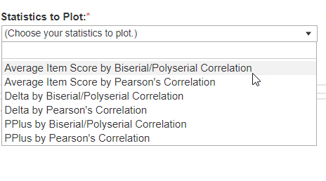
- Upon first initializing this dashboard, the filter will display as (Choose your statistics to plot) and a selection must be made. Select the dropdown icon to see the plotting options for this analysis and make a selection. No plots will display until this selection and the selection for the Analysis filter are made.
- The dropdown list contains all possible combinations of difficulty statistics (Average Item Score, PPlus, Delta) and discrimination statistics (Biserial/Polyserial Correlation and/or Pearson's Correlation) based on the analysis selected.
- After viewing the plot(s) for the selected statistics, use this filter to continue to move through each statistic to review one at a time.
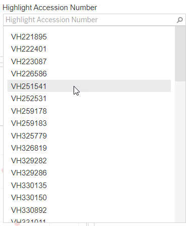
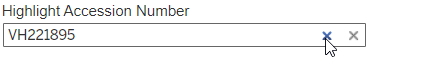
Highlight Accession Number: Users can highlight a specific accession number in the plot(s).
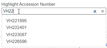
- Accession numbers are listed alphabetically but users can enter into the search text box (with the gray font text "Highlight Accession Number) to narrow the selection as needed to find the accession number they want to view.
- When selecting an accession number, it will automatically highlight that item in the plot(s) below. If both reference and observed scatterplots are displayed, that item will be highlighted in both.
- To close out of a selected accession number, select the "X" icon in the filter.
Search within the filter: Close out of selection:
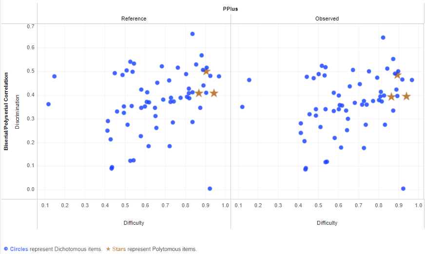
Scatterplot Display:
- When applicable, scatterplots for the reference statistics are displayed to the left of the observed statistics histogram.
- Items with missing statistics value (for either the difficulty statistic or discrimination statistic) will not be plotted. Users should refer back to the Item Summary report to view the items for this analysis if they need to identify which items have missing statistics. A footnote is included in all reports reminding users of this detail, even when not applicable for the plot being viewed.
- Only dichotomous items are included in all plots except PPlus by Correlation.
- When applicable, PPlus scatterplots will display both dichotomous items and polytomous items. Dichotomous items will be plotted with blue circles and polytomous with orange stars to differentiate them for the reviewer.
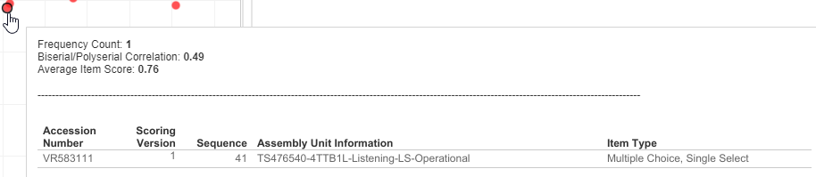
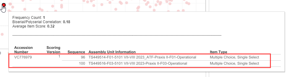
- A tooltip is available when hovering over a data point to identify the statistic values. The tooltip also includes information to identify which item(s) are represented by the data point.
- There is a potential for item overlap if more than one item has exactly the same unrounded x and y values. As a result, a frequency count of how many items are represented by the data point and the list of those items is included in the tooltip.
- Data points that represent more than one item (have a frequency count > 1) will be slightly brighter/darker as an additional indication to the user.
- If an item has more than one assembly unit and the user selected to combine statistics by accession number, then the accession number and scoring version appear once and are counted as one item in the frequency count, but each assembly unit, sequence, and item type are displayed as separate rows within that accession number.
- There is a limit to how many items can be displayed within one tooltip (approximately 20). If the number of items overlapping at one data point reaches the tooltip space limit, a message will appear in the tooltip that "View is too large to show" and the user will not be able to see all the items displayed. If this occurs, refer to the Item Summary dashboard directly to identify all the items with the relevant statistic values.
Example showing tooltip display of an item with multiple assembly units combined into one set of statistics:
- If desired, utilize the zoom feature to expand the plot to get a closer view of a set of data points. Refer to Visualize Results for general information about zoom functionality.
- Summary statistics are displayed to the right of the plots.